Art File Requirements Guide
ACCEPTED FILE TYPES
Adobe Illustrator
Adobe Acrobat (PDF)
Adobe Photoshop
UNSUPPORTED FILE TYPES
Adobe Indesign
Quark Express
Microsoft Programs
GENERAL DOCUMENT SETUP
- Set Illustrator to CMYK Color Mode. (No RGB)
- Set Raster Image Resolution to 300ppi
- Set Raster Effects to 300ppi
- Any rasterized images should be at least 300dpi or higher at the size they are used in the label artwork. This will allow for a quality output label.
- Any bitmapped images should be at least 1200dpi or higher at the size they are used in the label artwork. This will allow for a quality output label.
- Make sure all colors used in your design are labeled clearly and properly within your files.
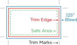
- Include between 1/16″ and 1/8″ Bleed Area for any graphics that extend up/past the edges of the Trim Edge. This is to allow for a proper die cutting tolerance.
- Copy, logos, and graphic elements should have a 1/16″ to 1/8″ Safe Area away from the Trim Edge.
For help with understanding how to setup an artboard please visit:
https://helpx.adobe.com/illustrator/how-to/artboards-basics.html
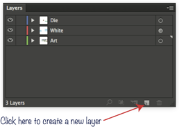
LAYERS
Die line, graphics, white, and all other specials (Hot Stamp, Emboss, Spot Varnish) should be set up on separate layers.
Tip: Creating and naming layers in your document keeps all graphic elements organized. This eliminates any confusion with the Art Dept. when files are reviewed.
TYPE / TEXT SPECS
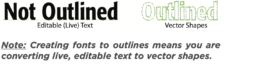
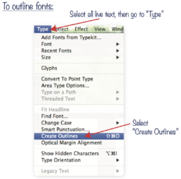
OUTLINE TEXT
All files must have fonts converted to outlines or include all fonts when submitting final art.
POSITIVE TYPE / FONTS
- Minimum type size: 5 pt
- Minimum rule / line size (stroke): .25 pt
- For best results, text should be created from one solid color.
- Text should always be created in vector format. Raster-based text will have jagged edges, making small text very difficult to read.
- On small type sizes (5 to 8 pt) use boldface, sans serif fonts. Register marks, Trademarks and Copyright marks (®,™,©) below 6 pt must be bold.
- Fonts must be converted to outlines, please keep in mind they are no longer editable.
- Avoid True Type Fonts
REVERSE TYPE
- Minimum type size: 6 pt
- Minimum rule / line size (stroke): .75 pt
- Minimum recommended for a channel or rule seperating two color areas is 1.5 pt.
- For best results, reversed text and objects should be created from one solid color surrounding the reversed area. (Flexo)
- It is always best if any reversed text is in a bold font.
COLORS
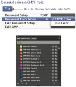
All files must be in CMYK color mode, not RGB.
Note: Files supplied in RGB mode will be con-verted to CMYK. This changes color values and we can’t guarantee color accuracy.
- Files can be created using CMYK or PANTONE Spot Color inks.
- PANTONE Spot Colors must be called out as swatch “PANTONE XXX C”. Convert all “U” and “CVC” inks to “C”.
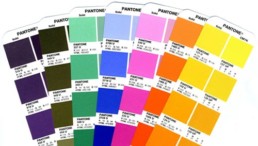
- Select PANTONE colors from the PANTONE + Solid Coated swatch book ONLY
- Any random spot color names such as “Logo Blue”, “PMS 367”, etc. will be converted to CMYK
- Any metallic inks from the PANTONE + Metallic Coated book will be converted to CMYK
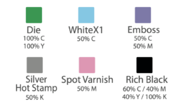
SPECIAL INK SWATCHES
These are our most commonly used swatches for special inks. Create Spot Color swatches with these names and values in your file when necessary.
Any swatch name and value can be used to represent a “Hot Stamp” swatch. For example, if you are using a gold foil, create a swatch color that looks like gold and name it “Gold Hot Stamp”.
If two Spot Varnish inks (plates) are required, create two swatches with different names and values. For example, “Spot Gloss” and “Spot Matte”.
SPOT COLORS
- Keep in mind that for Digital Printing, all production is done as CMYK, except for when white is required.
- We recommend using spot colors for the following circumstances:
- Text, in order to maintain optimum legibility.
- Elements that require vibrant color. CMYK is only capable of reproducing a portion of the full color gamut “accurately.”
- When a label needs a color that cannot be accurately reproduced with CMYK inks, such as a precise color matching of a corporate or logo color.
- Metallic or fluorescent colors must be reproduced as a spot color. (Flexo)
EMBED ALL IMAGES
- Images must have a resolution of 150 dpi or higher. The recommended resolution is 300 dpi.
DIGITAL VS FLEXO PRINTING
Large-scale digital printing processes create images by depositing toner directly onto on a surface, while flexographic presses use rubber or plastic plates to press ink onto a substrate.
This makes digital printing an inherently flexible process, yielding a number of advantages including:
- Quick turnaround: Setup is fast and jobs can be completed quickly, as there are no plates to create nor images to change or distort.
- Low-volume jobs: Thanks to the quick turnaround, digital printing is also ideal for low-volume work.
- Increased consistency: Computers manage the job in digital printing, leaving less room for human error. This means that “[when going] label to label, job to job, the colors are consistent and repeatable with no variation between operators,” explains FLEXO Magazine.
However, digital printing still comes with a number of disadvantages:
- Ink limitations: Digital ink fades more quickly than flexographic ink in direct sunlight, though this is usually only noticeable on items used outdoors over a long (or indefinite) period of time. Digital inks are also thinner, making them less opaque than flexographic inks.
- No in-line processes: Add-on processes such as cold foiling and lamination aren’t possible with digital printing.
- Lower durability: Labels created on a digital press don’t last as long or stand up to the elements as well as those created using flexo.
What are the main benefits of using Flexographic Printing?
- Better pricing on volume print runs.
- Better ink performance
- Ability to have add-ons like cold foil and different finishes.
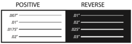
LINE THICKNESS
Digital – Print
- Positive Minimum Line: .007” (.5 pt)
- Reverse Minimum Line: .01” (.75 pt)
Flexographic – Print
- Positive Minimum Line: .01” (.75 pt)
- Reverse Minimum Line: .02” (1.45 pt)
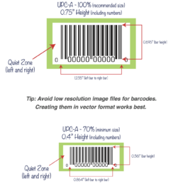
UPC BARCODES
- Since most barcode scanners utilize infrared light, avoid creating barcodes using red, light pink, orange, light brown, yellow, and metallic colors.
- To ensure scan-ability, it is recommended that barcodes are dark colored (black ink only scans best) on a white or light colored background.
- Allow enough room for a “Quiet Zone” or no-print area of at least 1/8” to the left and right on the barcode bars.
- Set the Bar Width Reduction to 80 microns. Any barcode below 70% is not recommended and will reduce the chances of it scanning.
Note: It is the Client’s responsibility to ensure that the barcode will scan.
LABEL UNWIND DIRECTION
This is an extremely important part of the production line where an incorrect roll of labels can cost everyone precious labor hours and unnecessary expenses.
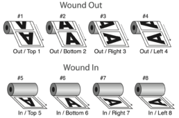
What is Unwind Direction?
Unwind direction is simply the way in which a label unwinds from a roll. This is most easily explained by looking at the unwind diagram.
- The orientation of the letter “A” represents which side of the label is coming off the roll first.
- “Wound Out” means the labels are on the outside of the roll.
- “Wound In” means the labels finish on the inside of the roll.
What will we accept?
SDC Nutrition Inc. will only accept labels that are provided to us in Wound Out Left (aka #4)